When a mobility company needed to imagine what came after their core product
How co-design and systemic thinking helped Via Verde define their next chapter, before the road ahead disappeared
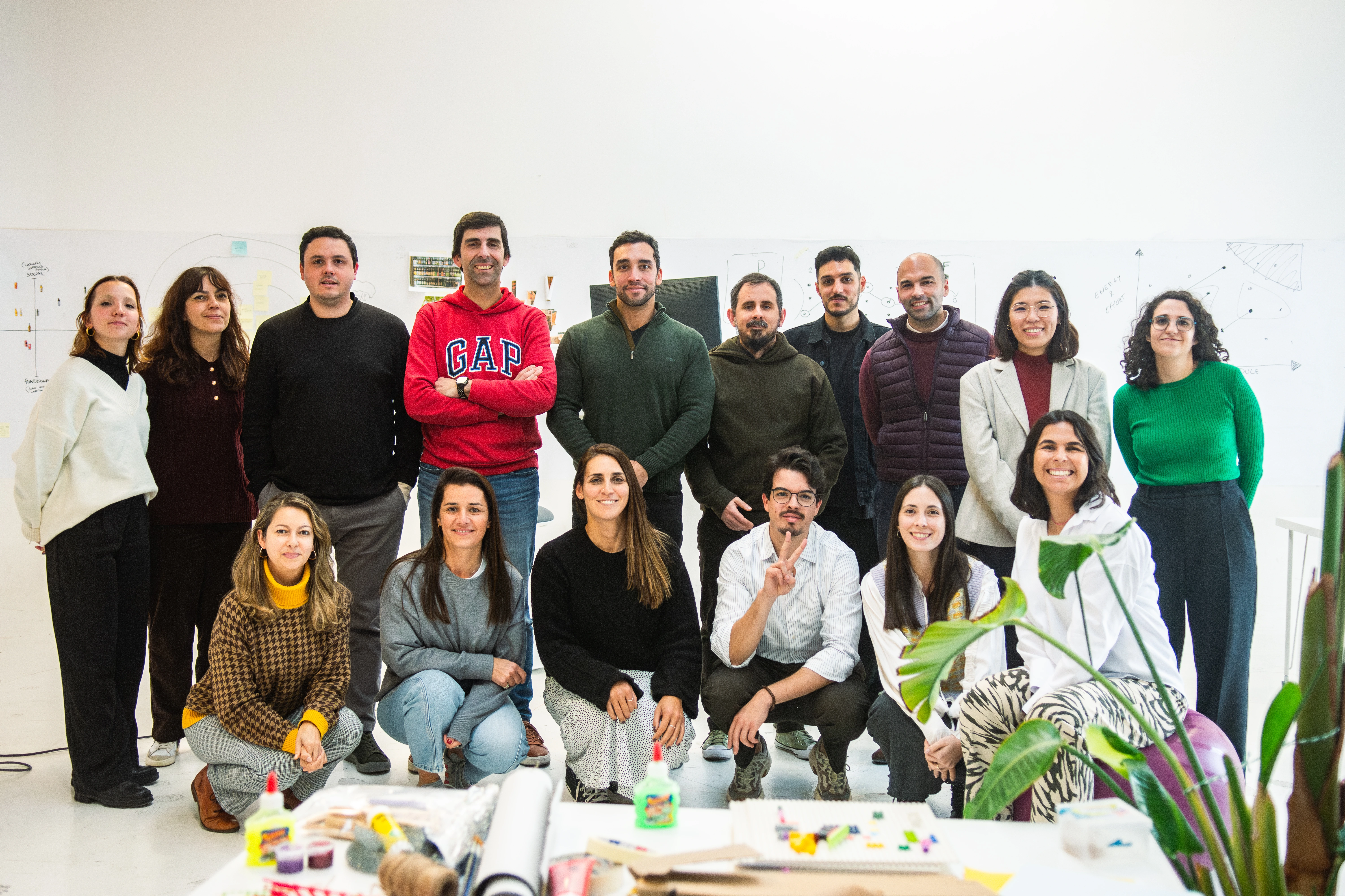
Team:
André Sequeira, With Company
Categories:
Design SystemProduct DesignUX Research

A market leader preparing for a future where their main product might not exist
Via Verde is Portugal’s leading mobility platform, best known for its electronic toll system. For most Portuguese drivers, it’s invisible infrastructure: it just works. But that invisibility is also a vulnerability. As autonomous vehicles, shifting urban mobility patterns, and new transport options reshape how people move, Via Verde faced a question that most companies avoid until it’s too late: what are we if our core service becomes irrelevant?
This project, run in collaboration with With Company, was about answering that question before being forced to.
Not one problem. Several, pulling in different directions at once.
The brief had multiple layers. Via Verde wanted to re-evaluate their app as a single portal for all their services. They wanted clear design principles to guide the integration of new features. They wanted to expand into micromobility and trip planning, targeting users who move through the city without a car. And they wanted to do all of this while remaining relevant to international visitors, tourists, and digital nomads, not just Portuguese drivers.
Underneath all of that was a harder question. What would Via Verde stand for if toll technology became obsolete? How do you maintain loyalty and legacy when the thing people associate you with might disappear?
There were real constraints too. They didn’t have full autonomy to change their services: external dependencies shaped what was technically possible. Their data was spread across multiple sources, and its quality was inconsistent because of it. Any solution had to work within that reality, not pretend it away.
The brief was ambitious. The constraints were real. The only way through was to work with everyone who understood the problem: the client, their users, and the data they were sitting on.
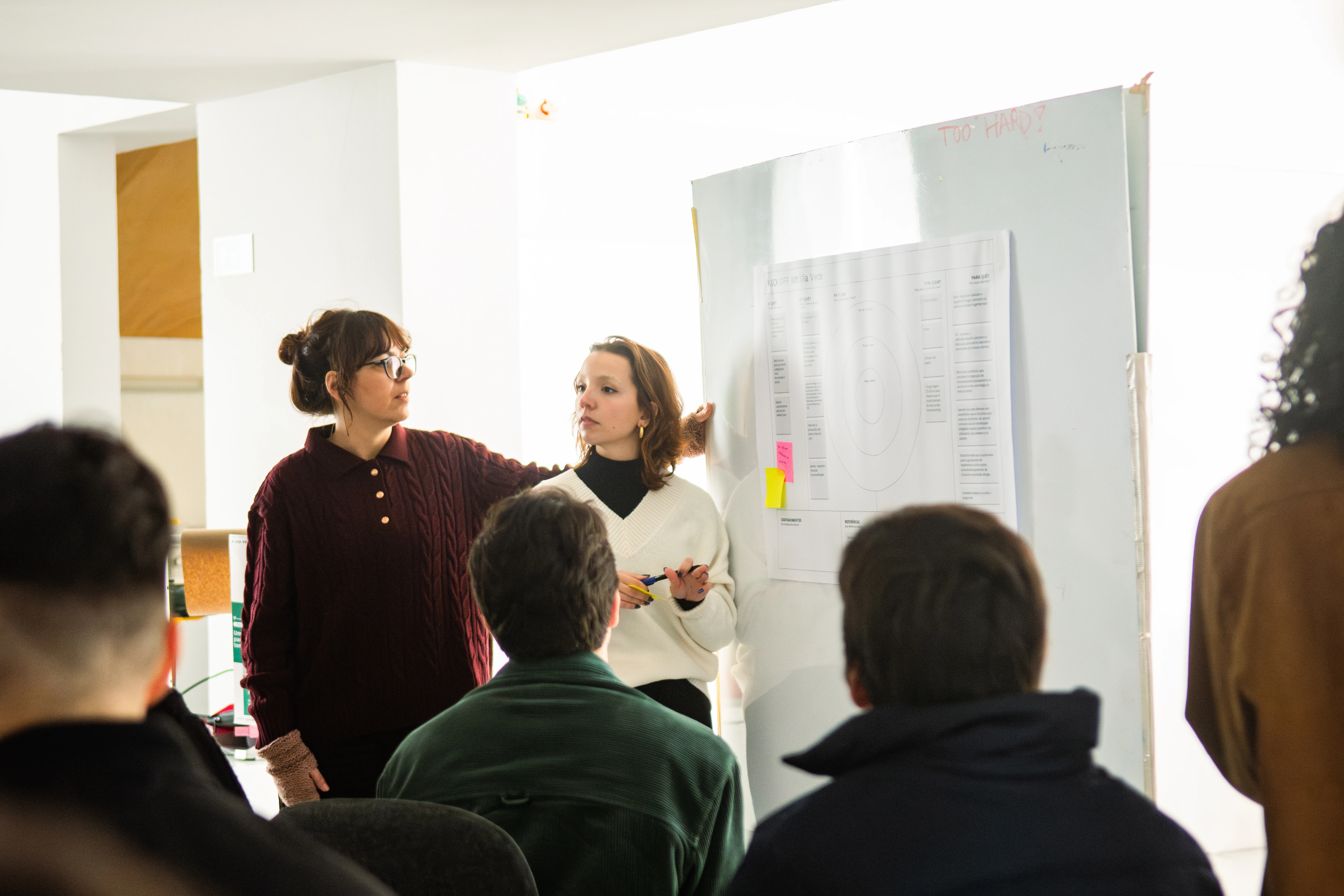
Two workshops. Three teams. One principle: the client knows their users better than we do.
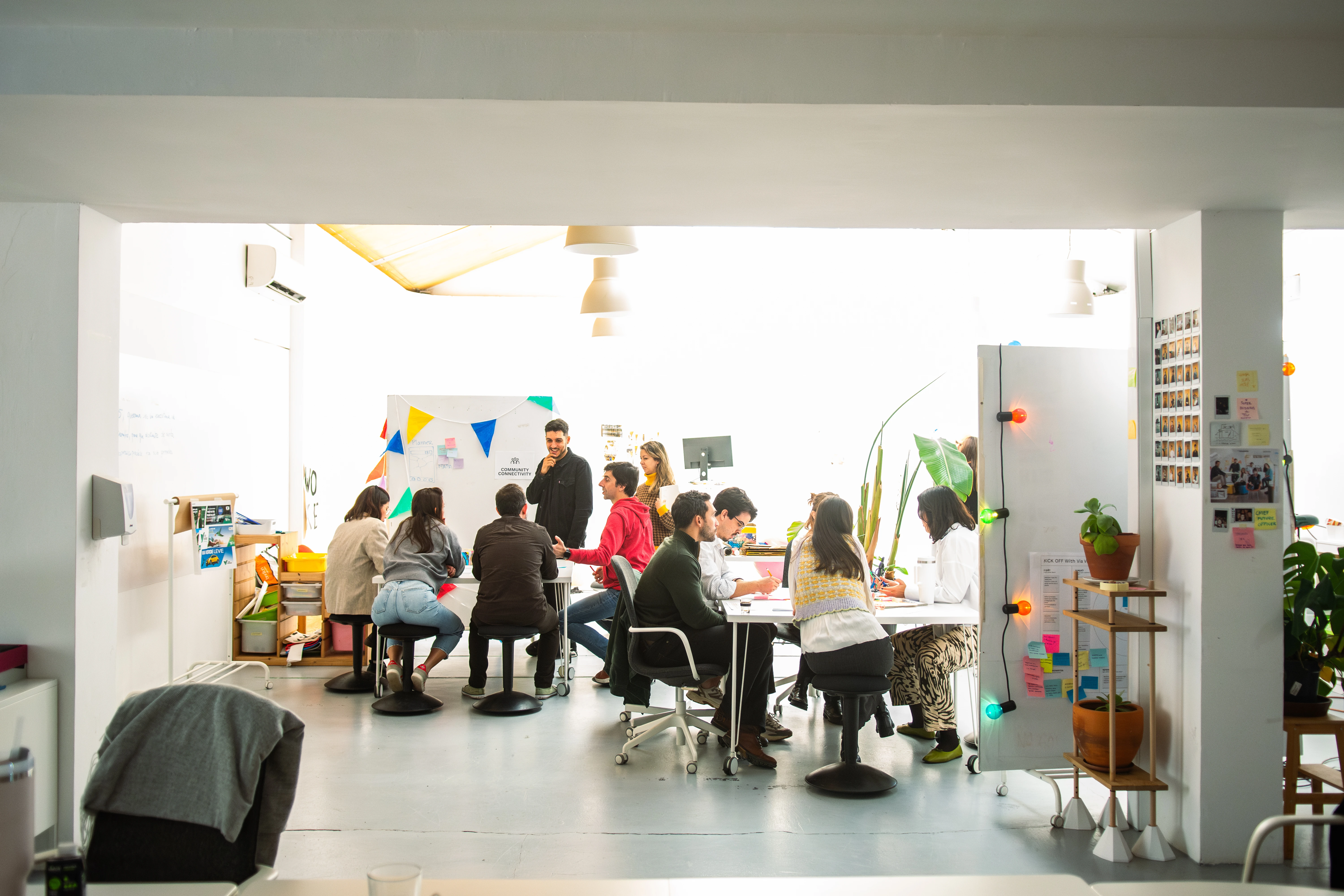
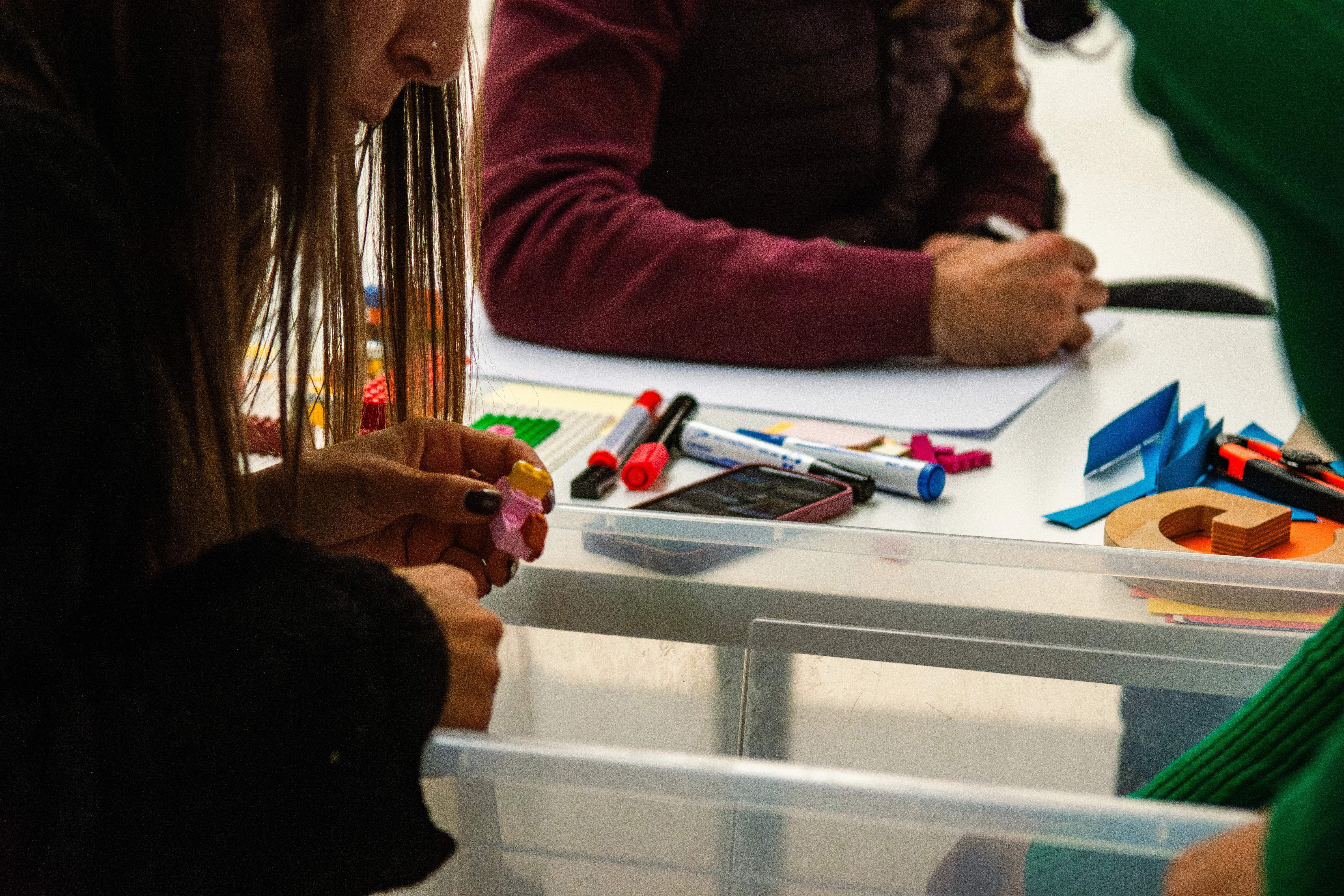
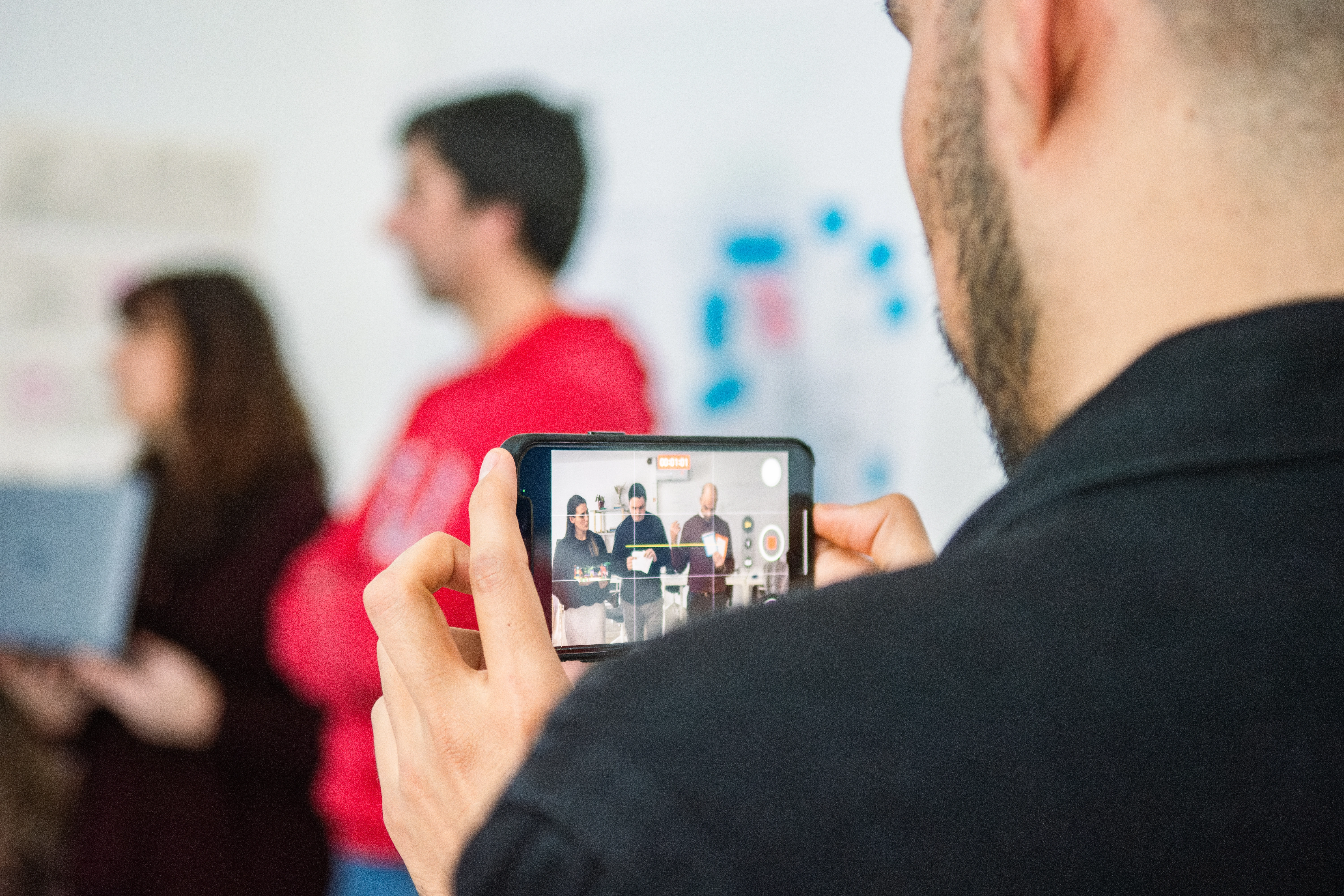
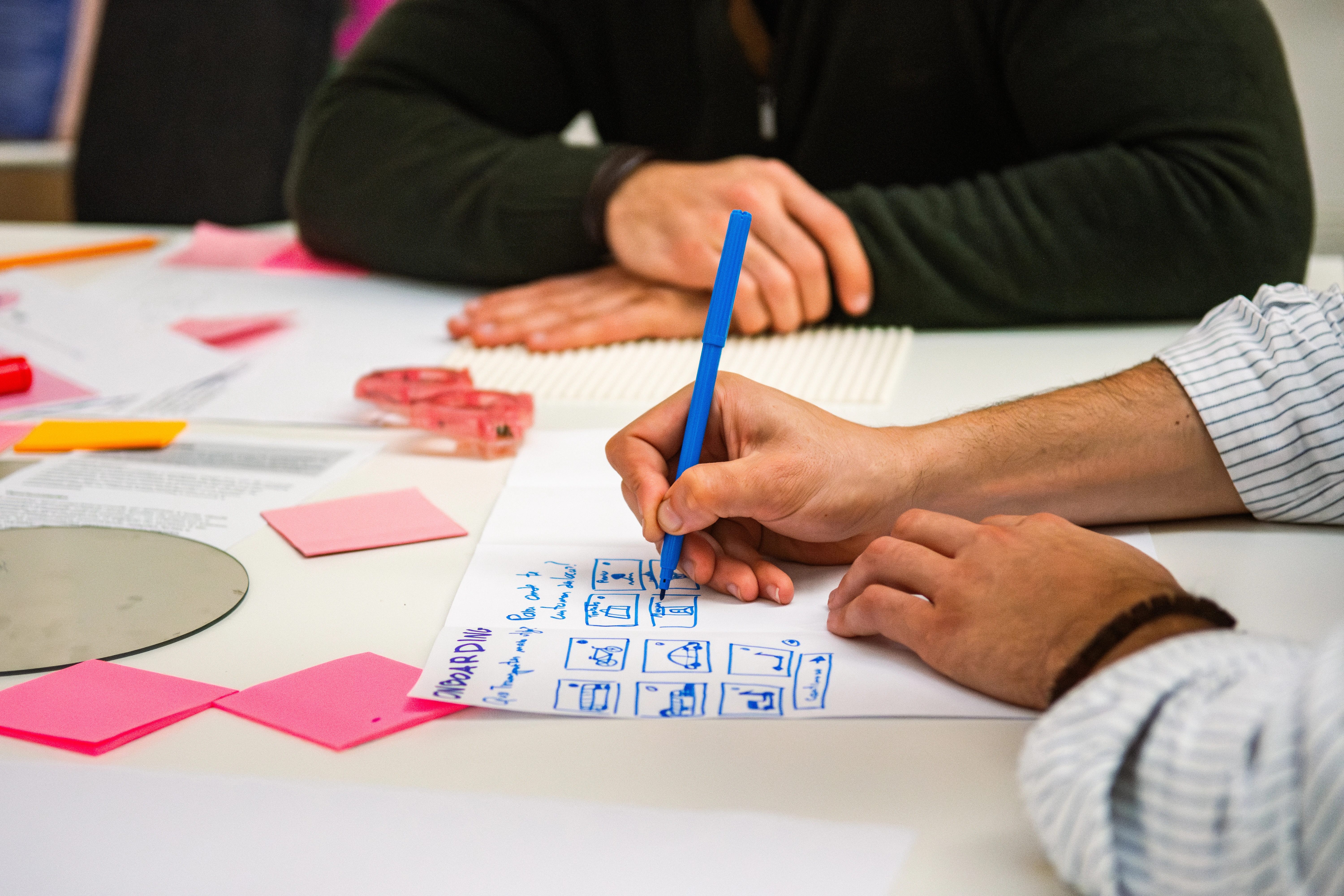
The project started with two full-day workshops. I worked as facilitator, designer, and researcher across both. The mornings were collective: everyone in the room, mapping the problem space together, surfacing assumptions, questioning what we thought we knew. The afternoons split into three smaller teams, each working with a specific set of user personas developed from research, generating ideas and testing directions.
This structure was deliberate. The best thing I can do in a room full of people who live with a problem every day is not to arrive with answers. It’s to create the conditions for the right answers to surface. The Via Verde team understood their clients. Their users understood their own lives. My job was to help translate that knowledge into something that could become a product.
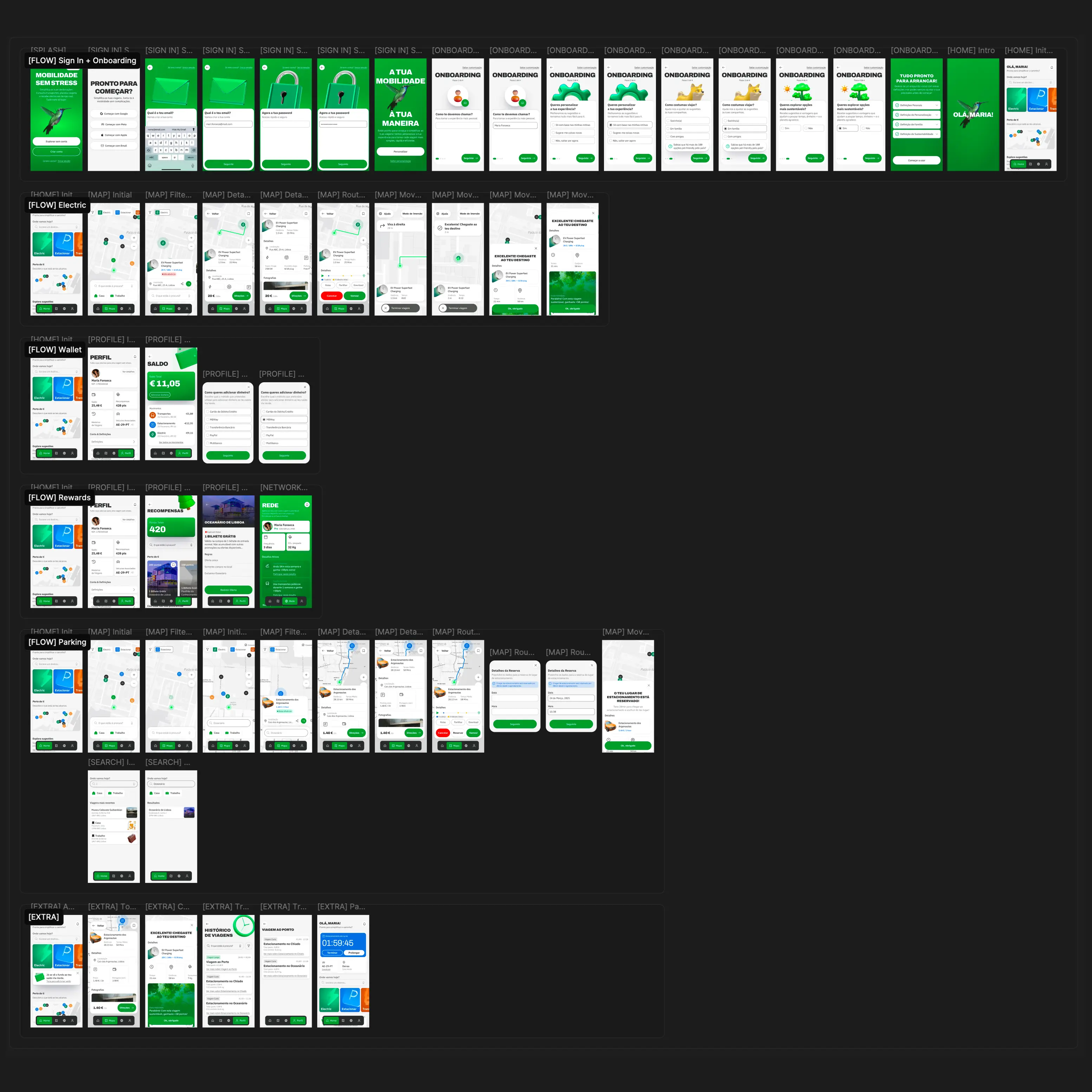
Between and after the workshops, I ran user interviews with around ten people to ground the concepts in real behavior, not assumptions. We then built a prototype in Figma and returned to those same users for testing sessions to validate what we were proposing and sharpen what wasn’t working.
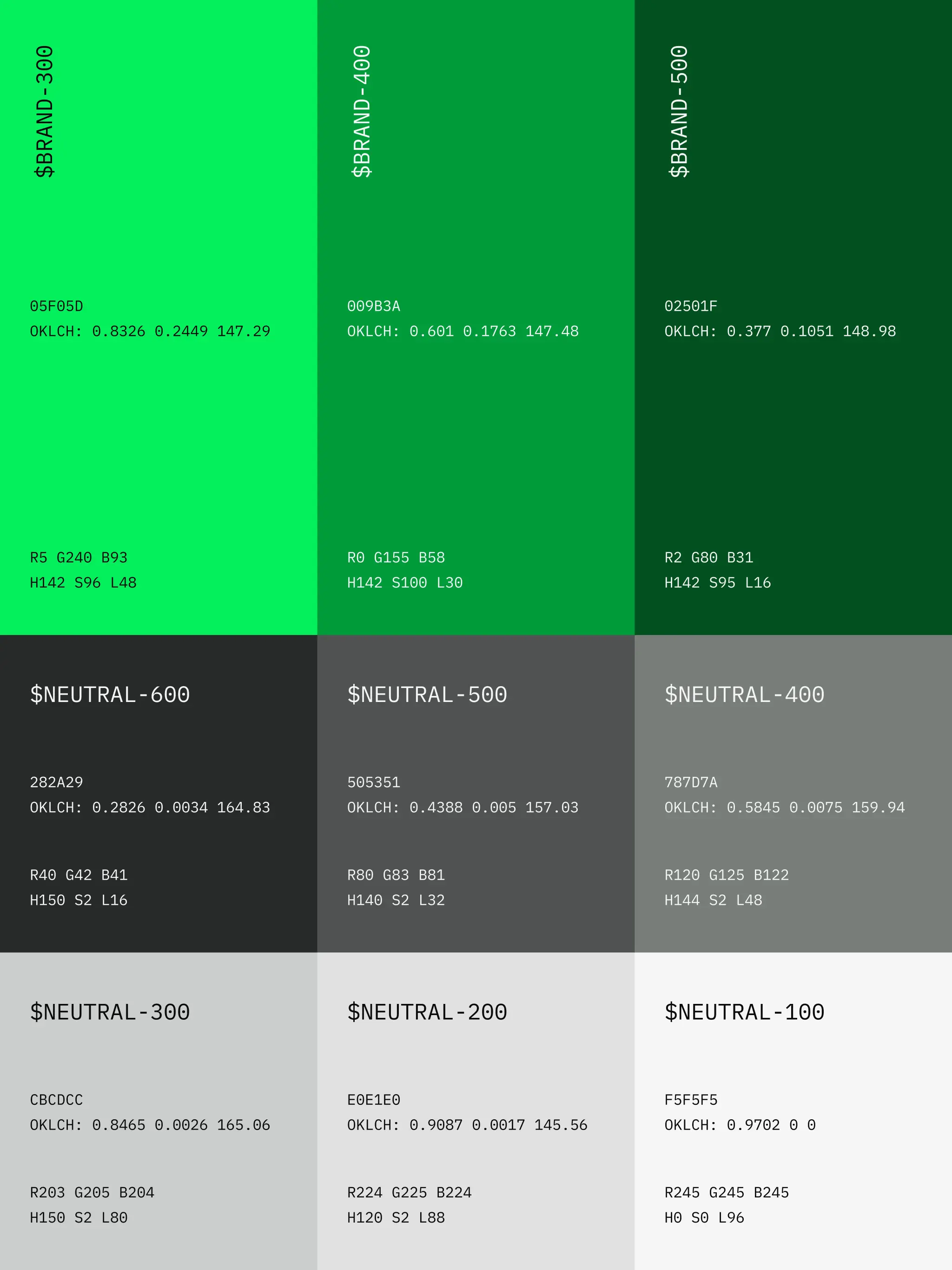
Alongside the concept work, I developed a UI Kit used across all screens in the prototype and produced a list of quick-wins for their current app: color contrast failures, font-size issues, spacing and order problems, a collection of accessibility improvements that could be applied in the short term without waiting for the full vision to land.

A concept for intelligent mobility. And a clear path to get there.
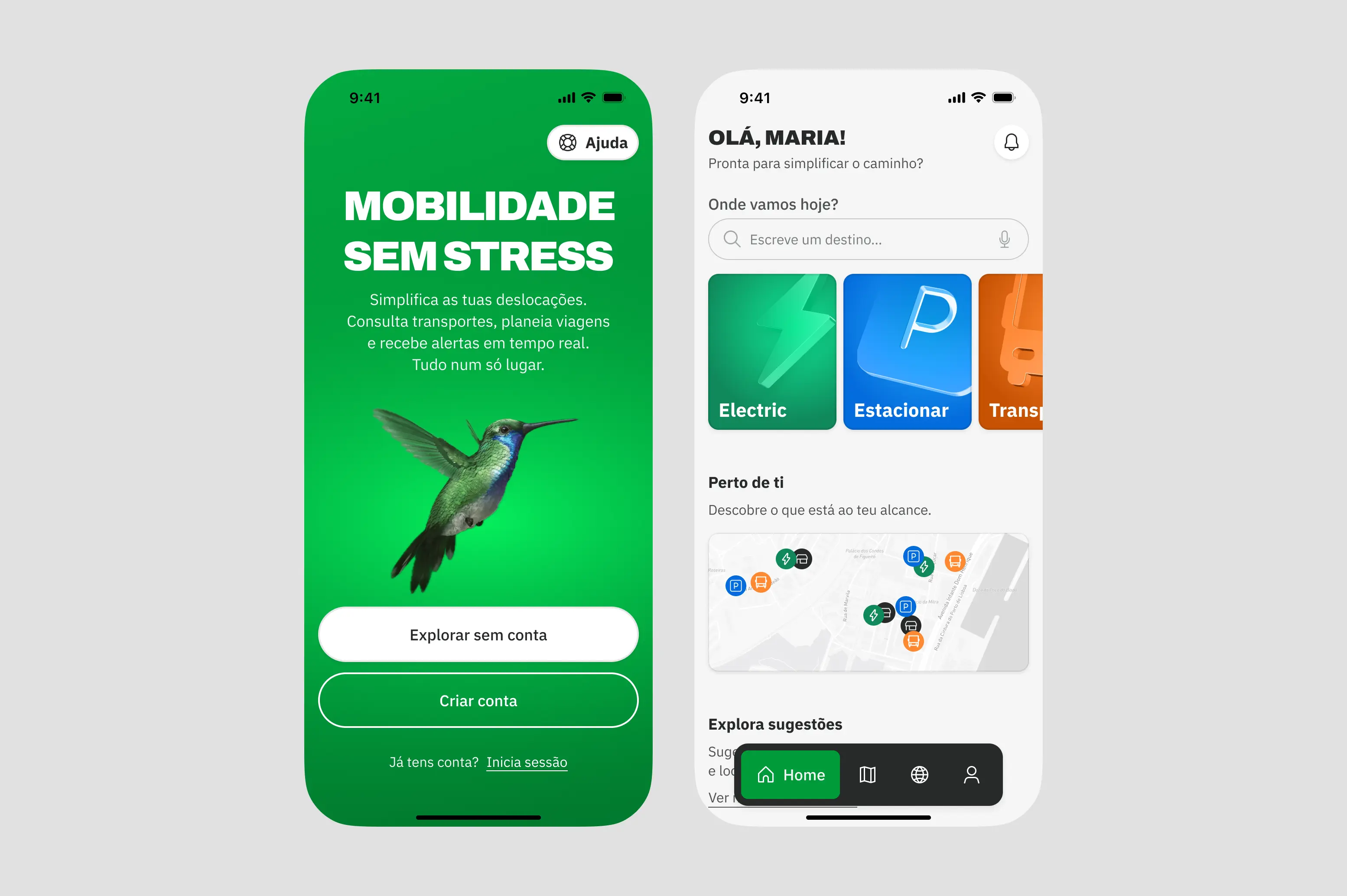
The output was a validated concept for a new Via Verde app: an intelligent mobility platform that simplifies and optimises every aspect of daily movement, whether you’re in a car, on a bike, or navigating public transport in a city you’ve never been to before.
The concept included features not present in the current product, each grounded in what we learned from the interviews, workshops, and co-design sessions. A mobility planner integrated with maps. An experience that works equally for daily commuters and first-time visitors. A design foundation that could absorb new features without losing coherence.
The UI Kit gave the concept a visual language consistent enough to test, flexible enough to grow. The quick-wins list gave the client something actionable immediately, independent of how long the larger vision would take to implement.
The concept was presented to Via Verde and Brisa stakeholders and validated through user testing with participants from the original research pool. It hasn’t been shipped yet. That’s not unusual for work at this stage. The value isn’t in the launch. It’s in the clarity: a company that came in with several competing directions left with a coherent vision, a tested prototype, and a set of design principles solid enough to guide what comes next.
The people in the room already know the answer. Your job is to help them say it.
The most valuable thing I brought to this project wasn’t a framework or a methodology. It was the discipline to ask questions before proposing solutions, and to create a process where the people closest to the problem could actually shape the outcome. The client knew their users. The users knew their own friction. The workshops worked because they were designed to surface that knowledge, not replace it with ours.
That principle sits at the center of how I work. Design doesn’t decide what people need. It opens the door for them to show you.